Did you know there is a company called Pantone that comes up with popular color combinations we will see in decorating, furniture, and even fashion? I was first familiar with Pantone during the years I’d worked with graphic designers who’d have a super fun job of picking colors for brochures. Font colors, accent colors, a lot of thought goes into color combinations. As an Indianapolis Image Consultant, I always try to keep up to date with these Pantone updates with the seasons.
Graphic designers keep up-to-date with these color combinations too. They consult huge color wheels and select the squares of color and attach them to the project so we’d know what they might look like after printing. As a result, the prints came out better and the color was more sophisticated and vibrant. However, most old-time designers would still attach the Pantone ink colors to make sure the project stayed true to the plans during the printing process.
Anyway, fast forward to today — Pantone is one source that tells us what colors they are seeing in design.
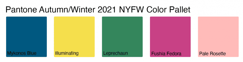
2021/2022 Fall & Winter Pantone Color Pallet
According to Pantone Color Institute experts, the colors for the Autumn/Winter 2021-22 emphasize our desire for a more versatile rand of hues that embraces and accommodates the various possibilities of their lifestyle. They encourage personal expression, whether conservative or quirky; and they embrace the calm and healing we are feeling during COVID and a rainbow of joy and hopefulness.
You might ask yourself, how in the world do I wear these bright colors. You might be totally stumped. Luckily, your favorite Indianapolis Image Consultant is here to help. Learning what colors work for clients, and beyond that how to mix and match colors in outfits are really the bulk of the many hours of training I had to take to even call myself an image consultant.
What did I learn? I can’t tell you all of that here, but I can tell you this: Many colors look amazing together, and you certainly don’t have to match anymore.
How To Add Pantone Colors To Your Fall Outfits

Here are some common things I consider as I put together outfits for myself and others:
- You DON’T have to match colors in your outfits.
- To have many outfit combinations you first need a good number of neutrals in basics. I am referring to jeans, coats, sweaters, pants. Pick these items in neutral colors such as navy, olive, grey, cream, white, brown, burgundy, rust, black, camel. To really drill down the best neutrals for you, I recommend a color analysis (yes, I do them). For me, the best neutrals for a Spring, which is what I am, are brown, camel, navy, cream, rust, and olive. Then I add prints and accent colors to these colors.
- The colors above will go beautifully with many neutrals. Try pairing Navy + Mykonos blue. Navy would be a great neutral color to pair with any of the Pantone Fall/Winter 2020/2021 colors.
- Olive, as well as grey, will coordinate with all of these colors as well. Olive and red are absolutely beautiful together. I also love olive and burgundy.
- Camel is another good neutral option. I would pair camel with Leprechaun green or either Fushia Fedora or Pale Rosette.
Indianapolis Image Consultant Can Help Find The Best Color Combinations For You!
If you’d like help in putting together some new outfit combinations, reach out for a closet consult and personal shopping appointment. Once you discover your color pallet, you’ll be able to dress for any season! Contact me to learn more.
Keep is sassy, Indy!
Beth Divine, MA, AICI-CIC, Indianapolis Image Consultant

